

Hello folks, and welcome to another edition of Box Art Brawl!
In last week’s edition, Metroid Prime – one of the greatest console games of all time – entered the ring. As we’d predicted, it was a pretty close battle, but Japan’s more action-packed (if you can call it that) design just managed to beat out North America and Europe’s more restrained approach with 53% of the vote. It just goes to show that even the most iconic box art design is not necessarily the best one.
This week, we’re going to be looking at another classic entry in the Castlevania series: Castlevania: Circle of the Moon for the GBA; known as Akumajō Dracula: Circle of the Moon in Japan, or just ‘Castlevania’ if you’re in a PAL region. Released back in 2001 as a launch title for the handheld console, Circle of the Moon was critically acclaimed by critics and fans alike and is still held in high regard today (though it’s safe to say that Castlevania: Aria of Sorrow takes the title as the GBA’s very best Castlevania game).
North America and Europe are once again teaming up for this week’s brawl to go up against Japan. Despite the fact that the PAL release of the game removed the ‘Circle of the Moon’ subtitle, the actual design of the box art itself is near enough identical, so we won’t be pitting these two against one another.
Be sure to cast your votes in the poll below; but first, let’s check out the box art designs themselves.
North America / Europe
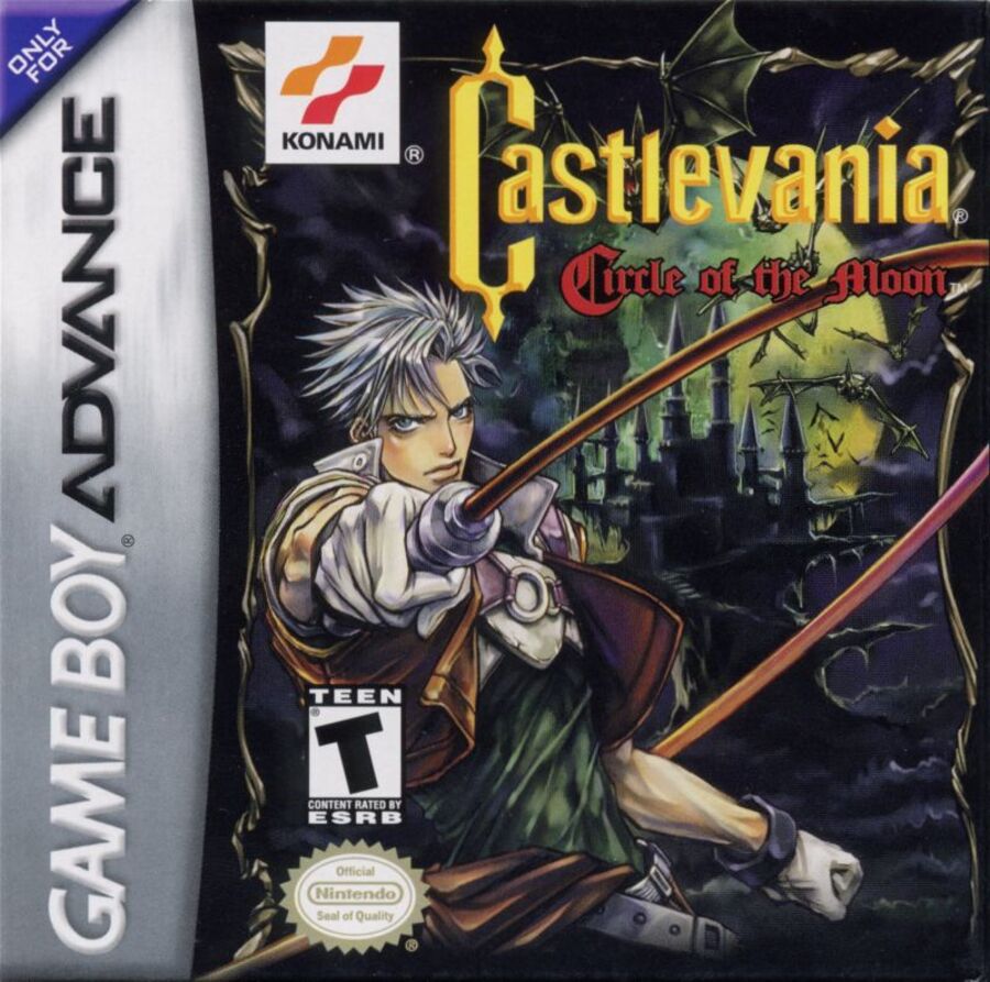
This is the box art you’re all familiar with, right? Given the form factor of GBA game boxes, Konami naturally only had so much space to work with. We’ve got the game’s protagonist, Nathan Graves, front and centre weilding the franchise’s iconic whip. In the background is, of course, Dracula’s castle, which is suitably dark and gothic with a bunch of creepy bats flying out towards the viewer. Finally, the greenish glow of the moon (which is also circular, eh??) provides a nice atmosphere to the image overall, and you can see its hazy light hitting the surface of the castle walls and its surrounding environment.
It’s a great image, all told, and if it weren’t for the stiff competition from Japan, we’d be quite happy to sing its praises all day long.
Japan
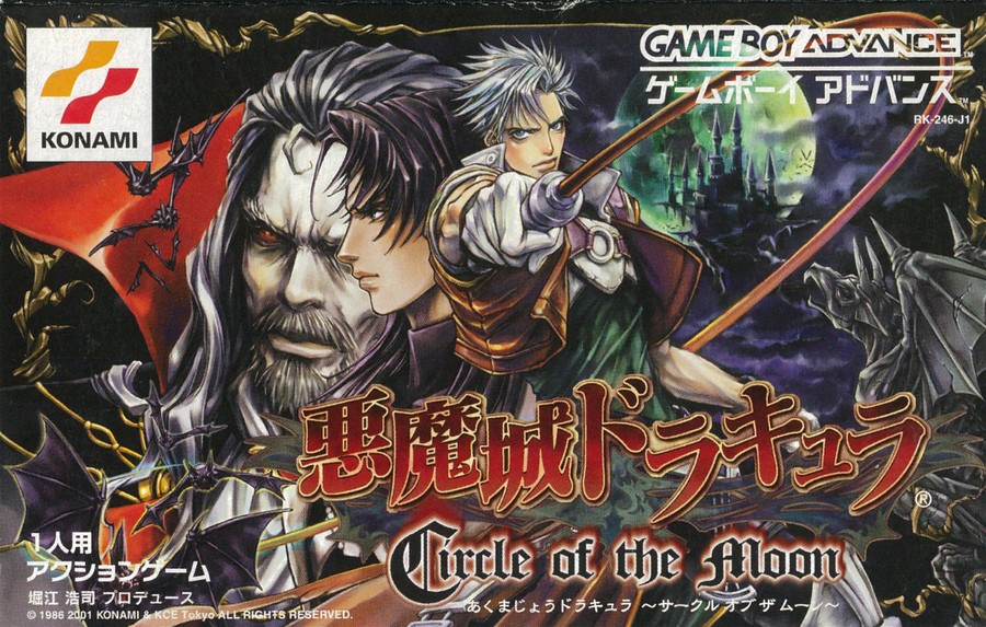
Publishers generally had much more to work with in Japan when it came to GBA game boxes; the landscape orientation provided a lot more space for additional artwork, and this is perhaps most evident in the box art for Castlevania: Circle of the Moon. Nathan Graves is still there, of course, in the exact same pose and against the exact same background as the US/EU box art, but we’ve got so much more here. Directly to the left of Graves is a side-on profile of his training partner, Hugh Baldwin, then next to him is a man that really needs no introduction: Dracula himself.
The addition of the extra characters brings a lot more variety to the artwork, both in terms of composition and colour use, not to mention the infinitely more striking ‘Akumajō Dracula’ logo. In a lot of instances with box art, less is better, but we’re prepared to go out on a limb here and say that for Circle of the Moon, more is definitely better.
It’s probably obvious which one we prefer this week, but what do you think? Make sure to cast your vote and share your thoughts in the comments below!
Thanks for voting! We’ll see you next time for another round of the Box Art Brawl.